When customers walk into a brick and mortar store, they are able to interact with both the products and staff. But what happens when they take that experience online? They lose the physical experience – no touching, no seeing. Want to know how that gadget really works? To bridge the gap between the physical and digital experiences, you need to be optimizing your product page to give customers the experience they want.
But what can you do to improve your product pages? Here are some tips for optimizing your product page that will get more customers to the checkout.
Imagine if a customer went into a computer store and bought a laptop without booting it up or even taking a good look at it. Sounds weird doesn’t it? But having poor product visuals creates that experience for online shoppers.
Want to make your products stand out on a dull computer screen? Just use a better photo. Image size and quality are very important for online shoppers. In fact, larger images can increase sales by up to 9%. But if you are worried about making your product page too busy with a larger photo, a zoom-in option is a great alternative. Including multiple pictures at different angles will help customers inspect your products further. The more they know, the less surprises they’ll get when the real product arrives at their door.
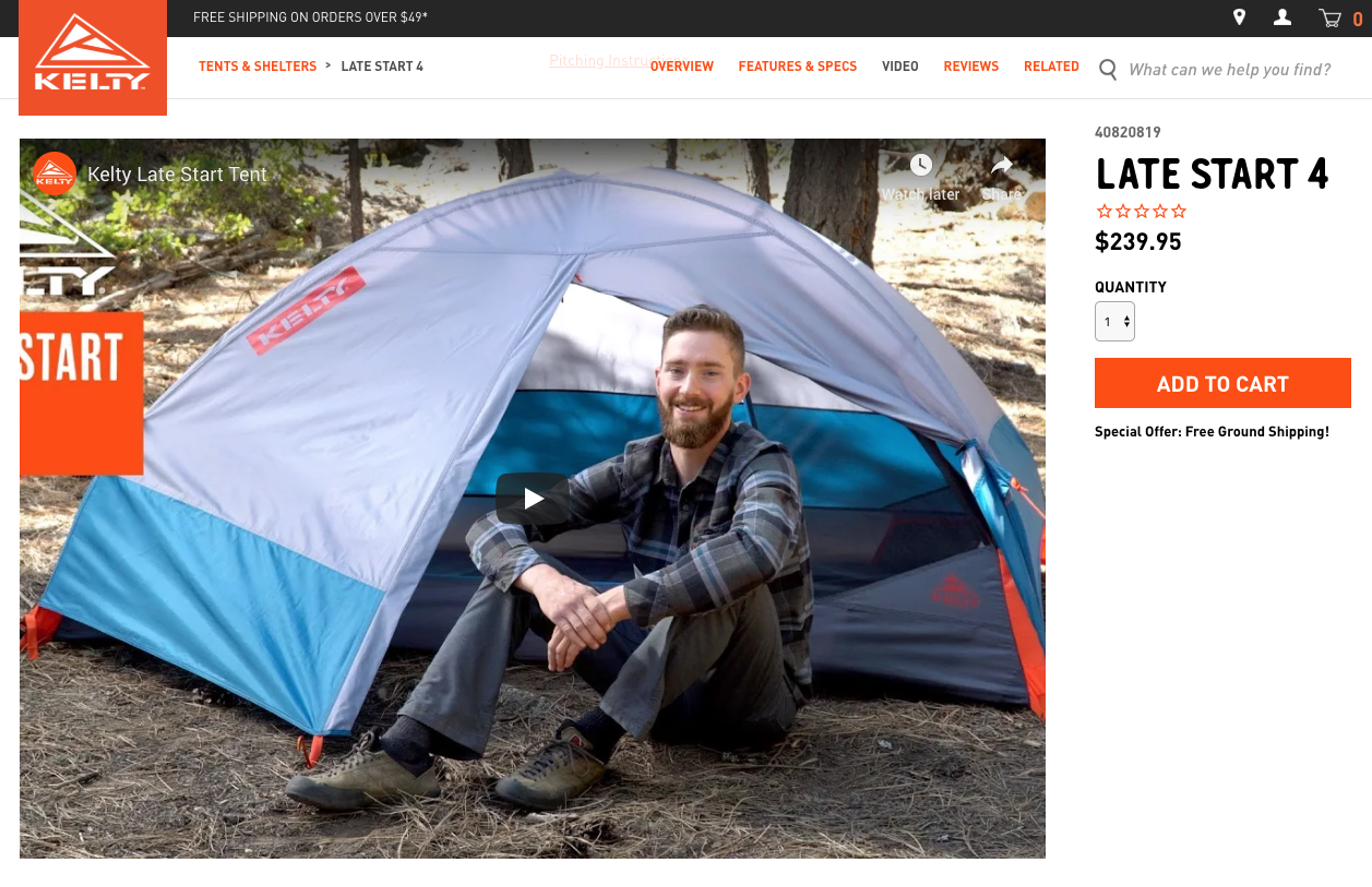
Video is another way to make your product pages even more effective. In a short minute-long video, you can squeeze in more information about a product than most customers would want to read. It also shows that you are willing to go the extra mile for your customers. By integrating videos into product pages, some businesses have seen increases of up to 79% for conversion rates and at least 50% for AOV. Investing in product videos can be costly, but could be the difference between a sale for you or a sale for your competition.

Kelty uses multiple visuals to provide their customers with more useful information about their products. By allowing customers to look at videos or multiple pictures of products, customers can get an experience close to that of a physical retailer, all from the comfort of their home.
Ever since reviews and ratings appeared on websites, you can now find them everywhere. That’s because businesses are realizing that personal experiences can influence other customer’s purchases. But how important are reviews for potential customers? They’re actually very important.
In a study done by Moz, they found that 67.7% of respondents believed that online reviews impacted their purchasing decision. Customers are looking for assurance from a third party that what they’re buying is really worth it. Reviews not only help customers feel confident about what they’re buying, but it can also help your bottom line. The more people that interact with online reviews, the more a business will experience increases in revenue, AOV and conversion rates. Reviews also allow businesses to learn more about what customers like or dislike about their products and make necessary changes. Every business says their product is the best, but having non-biased reviews and ratings reinforces their claim.

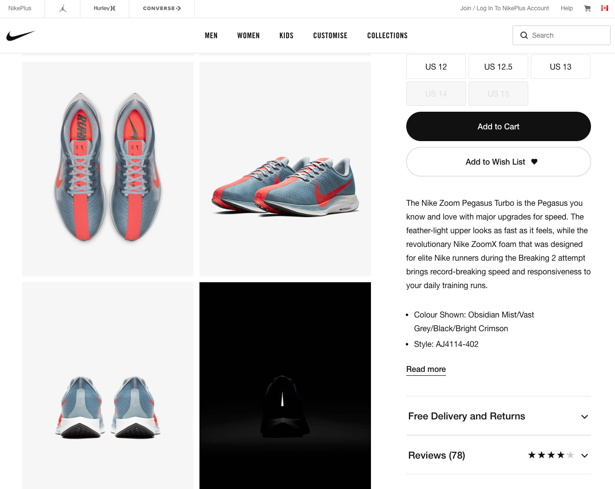
Nike is a great example of a business using reviews to reduce buyer anxiety. With a star rating and an easily noticeable review count, shoppers can gain insights before checking out. Nike keeps their page uncluttered by showing a high-level summary of the reviews next to the product, revealing the full reviews below the fold for those shoppers who want to dive deeper.
When shoppers visit your product pages, they are there for one purpose – to look at items. Businesses need to be cautious about what they include on their pages as customer attention spans are diminishing. So keep it simple. Customers aren’t as interested in fancy background images as they are with having a fast, convenient experience. A simplistic design will help keep your customers focused and could save you 50% of potential sales by helping users find the information they want. For product pages, less is often more in the eyes of the customer.

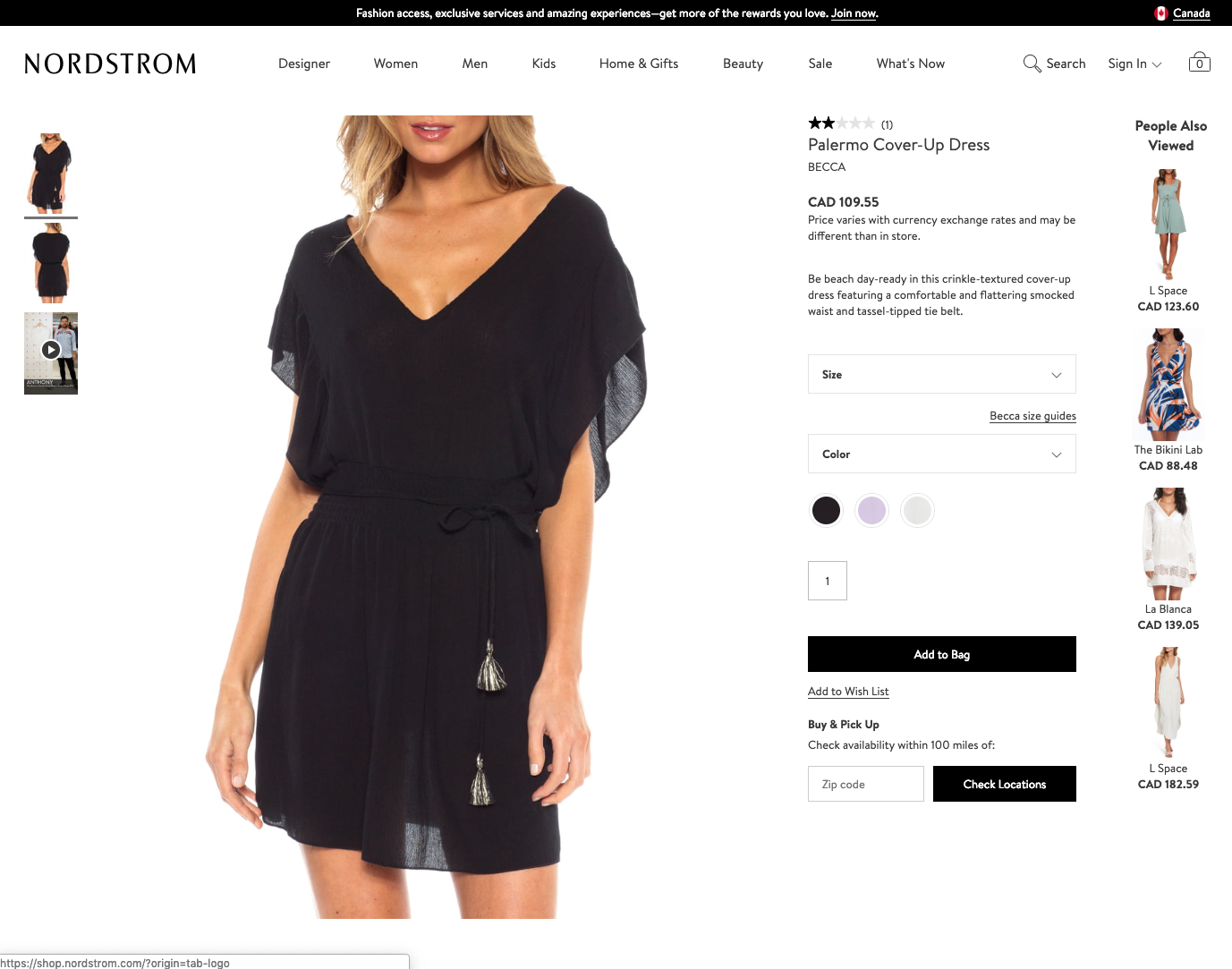
With the use of collapsed details and a simplistic design, Nordstrom is able to effectively showcase their products without the page being too busy. Even though their pages don’t catch the eye with colorful designs or flashy images, they provide customers with all the information they need to complete a purchase.
Price is an important part of your product page, but how you present your price can have a major impact on purchase anxiety. Are your prices all rounded numbers? Lots of zeros? That could be your first mistake. In his book Priceless, William Poundstone found that by using charm pricing, on average retailers saw their sales increase by 24%. Charm pricing relates to the theory that people are more receptive towards odd numbers. Have you noticed that prices often end with 99 or 95 cents? That’s charm pricing. So switch out those zeros for nines for the best results.
By addressing your customer’s anxiety upfront, you’ll be positioning yourself to capture more on-the-fence shoppers.