Looking for new ways to drive more ecommerce conversions and move the bottom line? Then look no further than your website’s usability.
It may sound too good to be true, but improving usability can result in an 87% increase in conversions and is one of Google’s main search ranking factors. So what is usability and how does it differ from user experience (UX)?
Usability is defined as the “effectiveness, efficiency and satisfaction with which specific users achieve specified goals in particular environments”, while UX is concerned with “all aspects of the user’s experience when interacting with the product, service, environment or facility.” In simpler terms, usability is how easy your website is to actually use whereas UX is the entire experience including before, during, and after using your website. Usability is important to providing a good user experience because if your website isn’t easy to use, your customer is going to bounce.

Here are four areas to focus on if you want to improve your website’s usability:
There’s nothing more frustrating than waiting for a page to load and even as much as an extra millisecond makes a difference. Amazon found that every 100ms of lag time costs them 1% in sales. So how fast does your site need to be? Users expect your page to load within two seconds or less, and will abandon it entirely if takes any longer than three seconds.
Extra consideration is also needed when it comes to mobile sites. Last year Google reviewed nearly a million websites and found that the average time to load a mobile site was 22 seconds. That’s more than 10x longer than your customers expect! By optimizing your images and reducing page bulk you can drastically reduce your load time. Not sure how your site compares? Use Google’s PageSpeed Insights tool and Mobile Speed Test to determine how quickly your site loads and areas you can trim to increase speed.
Speed isn’t the only thing you need to think about when it comes to making your website more user-friendly on mobile. While the number of people shopping on their phones has increased, smartphone conversion rates are still only half of those for desktop or tablet shoppers. So what’s causing the disconnect?
There are some common areas that cause visitors to get frustrated and bounce. To improve the usability of your mobile site make your buttons easy to tap, the text easy to read, and limit your use of tough-to-close pop-ups. You want mobile shoppers to glide through your site without any hesitation because it’s been found 46% of shoppers won’t purchase from a brand again if they had an interruptive mobile experience. To see how usable your site is on mobile, use Google’s Mobile-Friendly Test tool.

The call to action (CTA) is the main driver of conversion on your website because customers are guided through the purchase process by your CTAs. Unclear CTAs are like bad directions, you know where you want to go but you don’t know how to get there. Visitors want to buy from you, so make it as easy as possible for them to complete the purchase.
One of the more challenging aspects of crafting a clear CTA is the fact that visitors don’t give you much time to explain. One study found that in order to keep a user’s attention, you must explain your value proposition in less than ten seconds. Despite this, more than half of the top Fortune 500 companies don’t have a clear CTA button on their homepage, and that number is even higher for SMBs.
To help the effectiveness of your CTAs, make sure you use simple language that is easily understood. Avoid using overly complicated words and phrases, and keep it simple. Distill what your customer is going to get at the next step of the process into a short message, and then highlight these action phrases using colors and buttons to draw their eyes in. A good example of a solid CTA is on Evernote’s homepage.
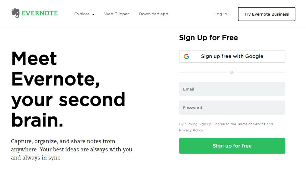
With a large headline and minimalist design, Evernote guides users to the green ‘Sign up for free’ CTA button. By keeping the language simple and removing distractions, it’s obvious what the next step is.
The average cart abandonment rate is almost 70%, and usability issues are a significant contributor. It’s crushing to get a customer all the way to the checkout only to lose them right before the purchase is complete. But it doesn’t have to be that way; by making your checkout streamlined and user-friendly, you can keep shoppers engaged until the confirmation page.
The best checkout experiences are short and painless. Everyone likes shopping but no one likes paying, so keep customers happy by reducing the number of required fields. And although getting users to create an account can speed up future purchases, forcing them to do so before they complete a purchase can kill the purchase momentum and ultimately risk losing the sale. Nearly four in ten shoppers abandon a purchase when they are forced to create an account during checkout. Instead, offer to create an account post-purchase.

It’s also really important that your customers can understand their order total. If you show a price in Japanese Yen to an Australian shopper, there is bound to be confusion. Save your customers the math lesson and ensure your cart is localized to their geographic region. Better yet, localize your payment options as well. The most popular ways to pay are different for each country. By localizing your payment options you can ensure your customers’ preferred way to pay is offered without overwhelming them with options not offered in their country.
How do you know if the changes you make will improve usability? You test it! The best way to do usability testing is to have a real customer try to make a purchase. Affordable tools like Optimizely and Crazy Egg can easily divert a small segment of traffic so you can watch how your customers interact with the latest updates. So review your page speed, mobile site, CTAs, and checkout process because even the smallest improvement can have a major impact on your sales.
By testing the elements above and making changes accordingly, you be removing more barriers and enabling more growth. Even minor tweaks can make a big difference, so focus on aspects that are manageable and enjoy the fruits of your labor.


