In the age of iPads, iPad minis, tablets, smart phones and desktops, responsive website design has become imperative when building user-friendly websites. For online merchants who continue to remain apprehensive about transitioning away from the traditional fixed-width web design, Jeffrey Veen, Vice-President of Products at Adobe explained why the development is so important.
“Day by day, the number of devices, platforms, and browsers that need to work with your site grows. Responsive web design represents a fundamental shift in how we’ll build websites for the decade to come.”
This fundamental shift - otherwise know as the new norm - will be a continually growing competitive advantage for online merchants who have undergone this change. Merchants who have not implemented responsive website design will find themselves facing the consequences, with the most detrimental being cart abandonment. Luckily, we’ve covered the basics for what you need to know.
Responsive Website design is an approach where the design and development of a website responds not only to the user’s behaviour but also to their environment, i.e screen size, platform and orientation. This practice consists of CSS media queries, fluid grids and fluid images, all of which contribute to an optimized, responsive website.
A core component of responsive website design, media queries allow CSS to only be applied when specific conditions are met. When written, a media query can be used to detect the website width on the device being used and serve CSS that rearranges the site’s content.
The breakpoint, otherwise known as the point where the layout of a website no longer looks good is detected through creating a number of media queries that utilizes responsive code. While there is no guide to defining standard page widths to target, the following resolutions are often used:
Simply put, fluid grids can be defined as percentage-based columns of content. So how does this differ from what was traditionally used? Originating in the print industry where publications remained a fixed size, pixels were originally used to define websites. A singular pixel is the smallest element of a picture displayed on a screen. The difference between this and fluid grids is that where pixels are a fixed size, with responsive website design websites are built using relative units like percentages. With this approach, the number of grid columns change depending on the width limits, hence the name fluid grids.
Responsive website design guru, Trent Walton was quoted saying that “to think about the web responsively is to think in proportions, not pixels.”
The fluidity of images is demonstrated by the pictures featured on the website automatically adjusting. In other words, images displayed on a web page should be able to shrink and expand within the confines of a fluid grid. CSS code is used to ensure that images will never be stretched or pixelated.
This technique is used by setting the max width of an image at 100%. So long as there is enough room in the HTML container, the image will be displayed at these dimensions. When viewed from a different screen size, the image will be scaled to fit the browser window. This strategy disallows images to be cut-off or pixelated. Skullcandy, a company that sells quality and stylish headphones has demonstrated a fantastic use of image fluidity throughout their website.
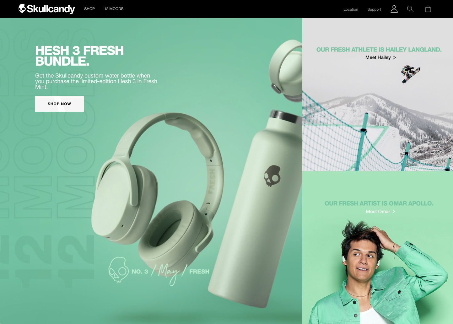
Source: Skullcandy
It is important to keep in mind that responsive website design is a combination of techniques. By combining the use of media queries, fluid grids and fluid images, among other strategies, online merchants can slowly transition away from days of fixed screen layouts. The concept of this technique is for websites to automatically adjust to accommodate for user’s browser and resolution, making their entire shopping experience even more seamless. With mobile and tablet online expenditure continually rising, online retailers who are not transitioning to responsive web design will begin to see the consequences- with one of the most damaging being checkout abandonment. This approach will not only better serve your customers but also save you time and frustration.


