A lot of time, effort, and money can go into driving traffic to your product pages. For you to make that kind of investment only to have visitors bounce without spending a dime can not only be demoralizing, but dangerous for your bottom line. Fortunately, a few simple tweaks to your pages can make a world of difference.
So, where do you begin?
To boost product page conversions, you need to focus on four core components: clear call to actions, compelling product descriptions, optimized images, and honest customer reviews.
One of the most important elements on your product page is your call-to-action (CTA), because it tells your customer exactly what the next step of the purchase process is. You’ve worked hard to get your product in front of your customer, and your CTA can either get them through the finish line to make a purchase, or stop them dead in their tracks.
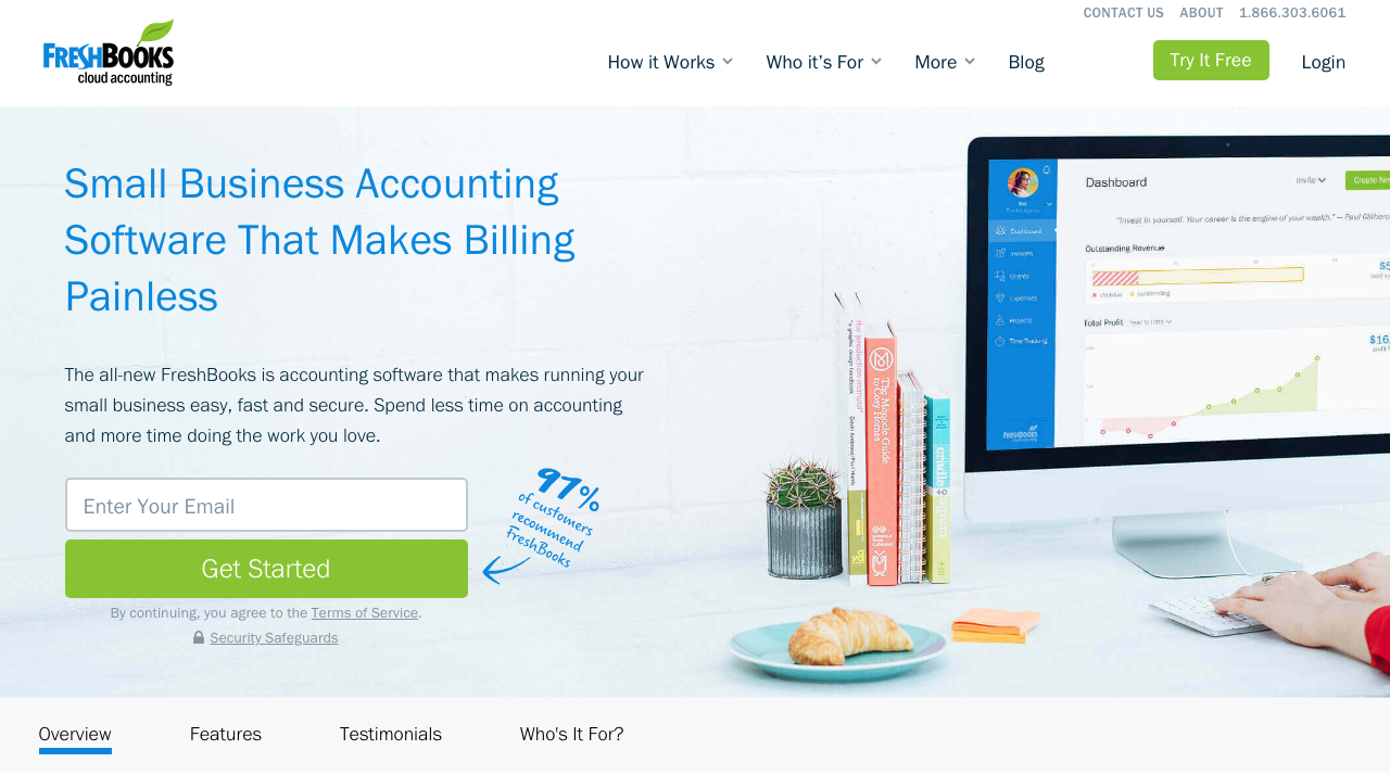
While ‘Add to Cart’ is a safe choice for ecommerce businesses, it may not be the most effective when it comes to your brand or product. If you’re a SaaS company, like FreshBooks for example, you may want to explore CTAs such as ‘Get Started’ or ‘Try It Free.’

You won’t truly know what CTA works best until you test it. And while conducting tests is certainly more effort, it could lead to triple digit increases in conversions when you do find the right message. Once you determine what verbiage makes the strongest impact, don’t forget to test the location, color, and size to further drive that conversion rate.
Another element that can have a big impact on your conversion rate is how you describe your products. Think of product descriptions as an elevator pitch for your product - too many words and you lose interest, too few and your customers won’t understand what makes your product special. There is no cookie-cutter length to how small or large your descriptions should be – take into account various factors such as the story behind it, its quality and how expensive it is. Sometimes more is better than less if it’s compelling.
If you’re selling another company’s product, one of the biggest mistakes you can make is to use the factory provided descriptions. While it might seem like a good time saver to use the supplied copy, it can harm your SEO ranking and diminish your brand identity. Google uses unique copy as a ranking factor, so if you have the exact same description on your site as your supplier, you’re going to be pushed down the ranking ladder and miss out on traffic. Instead, write your own product descriptions using your unique brand tone and voice. It’ll give you one more way to connect to your customers and boost your SEO ranking at the same time.
Regardless of whether or not your product has visual appeal, images are critical to your conversion rate. Ecommerce can be difficult for consumers. They lack the ability to get a first-hand experience of your offering until they either sign up, download, or purchase your product, which can ultimately cause doubt and purchasing friction. Images allow your customers to envision how your product will meet their needs without committing to anything beforehand. Not to mention the use of properly titled images will also help with increasing your SEO ranking.
By showcasing your product features with contextual images and screenshots and zooming in on the key details, you’re showing users what your software looks like “under the hood”, easing friction and taking the first step towards assuring customer success.
Finally, one of the easiest ways to reduce shopper anxiety is by letting your other customers do the selling for you. Customer reviews are an excellent tool for increasing conversions because they are an unbiased and honest source of feedback. A recent study found that displaying reviews on your website can increase conversions an average of 270%, and has even more of an impact if your product is priced higher.
Although you may be worried about the adverse effects of negative reviews, bad reviews aren’t always bad for business. In fact, the same study found that while high reviews are good, shoppers don’t trust a perfect 5-star average. More than 80% of shoppers seek out negative reviews, and products with a negative review have been found to actually increase conversions. Negative reviews not only help you learn more about how you can enhance your product, but they also build credibility, so don’t be afraid to hear what your customers like (and don’t like) about your products.
Just because there’s no one-size-fits all answer to designing a high-converting product page doesn’t mean you can’t start making changes to boost your conversion rate today. Start by focusing on one change at a time, pinpointing exactly what works and what doesn’t and continually improving in each iteration as you move along. Then rinse and repeat with other elements of your page, and before you know it, you’ll start seeing more conversions and more sales!