Good checkout design is critical to maximizing ecommerce conversions.
A well-designed checkout can greatly improve the customer experience, building trust and increasing sales. Meanwhile, a badly-designed checkout can create confusion and distraction, causing your customers to abandon their carts well before the finish line.
Despite their significance, however, checkout pages are often neglected by online retailers, who prefer to focus on the “front of house” – beautiful web designs and product photos that make their sites more visually attractive, rather than the checkout page itself.
While it’s certainly in your best interest to provide a visually-appealing first impression, the truth is that when it comes to actual purchases, your checkout pages are far more important than any other element of your website, and deserve just as much (if not more) of your attention.
In this article, we’ll take a look at four actionable steps you can take to improve your checkout design.
Complexity kills ecommerce conversions. The first step in any conversion optimization effort is to make the checkout process as simple and painless as possible.
All optimized checkouts have two things in common.
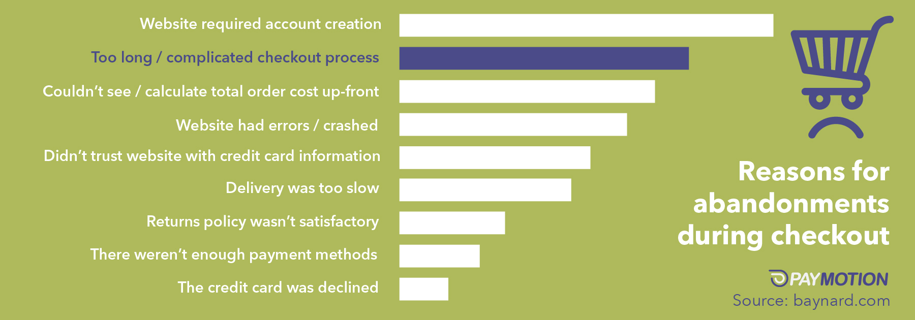
First, they are short. A recent Baymard Institute study found that 27% of customers abandon their carts because of an overly long checkout process. And much of that complexity was simply unnecessary. While the average checkout involves close to 15 form fields, in most cases, only 6-8 of those fields were truly vital to the purchase process. In other words, these companies could have cut the length of their checkouts in half – reducing cart abandonment significantly.
Second, they are completely linear – that is, they have no repeated steps. While this may sound obvious, many online stores continue to violate this design principle. The most common way this happens is with checkouts that have “steps within steps”. For instance, W.W. Grainger requires new customers to register an account before proceeding with their checkout, then sends them back to the initial checkout page once they’re done:
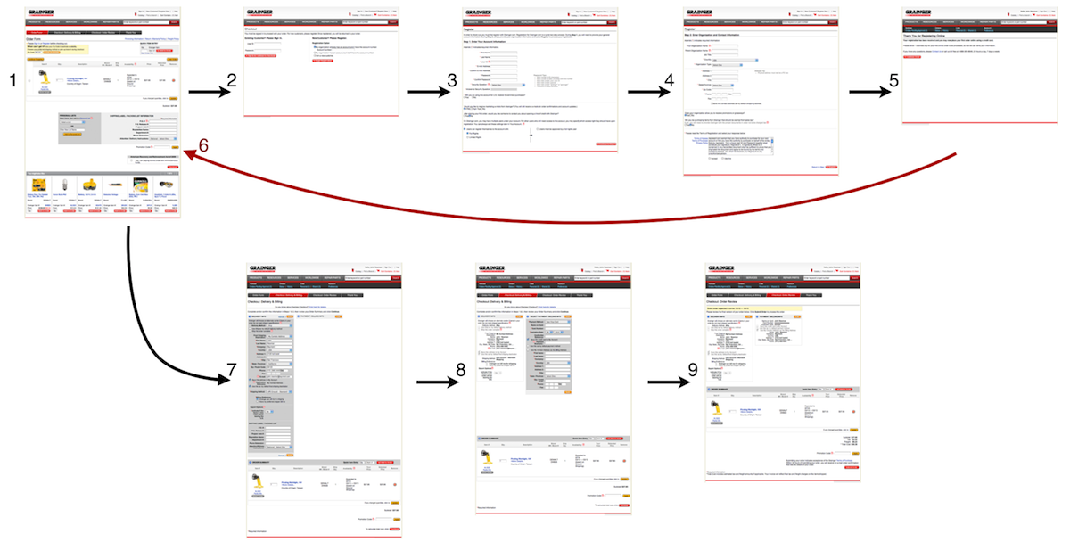
Source: Baymard
This is incredibly confusing for customers, and makes them feel as if there is an error in the checkout process. In many cases, that’s enough to send them packing.
Incidentally, this is also a good illustration of why requiring customer registration is a bad practice. Which bring us nicely to our next point…
Every online store should offer a guest checkout option.
According to VoucherCloud, 29% of online shoppers abandon the checkout process when asked to create a new account, yet many companies continue to make registration a mandatory requirement. While it’s reasonable to ask customers to register, this should be a strictly optional step, and should only be offered after a successful checkout. After all, if you had to pick one, which is better – a new account, or an actual paying customer?
There are two best practices to bear in mind here. First, if the user opts to checkout as a guest, capture their e-mail address early in the checkout process. This will allow you to follow up with an abandoned cart email campaign, which can boost conversion rates by more than 10%. Hyphen Mattress is a great example of this:
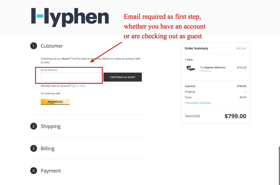
Source: Hyphen Mattress
Second, consider offering an incentive for signing up. Online customers are often impatient and will not be very inclined to stick around for registration after they’ve already made their purchase. But offer a discount on future purchases and they’ll be a lot more likely to invest the effort. Plus, you’ve just established a solid reason for them to come back and shop again. Speedo does this by offering 10% off the customer’s next purchase, netting them a remarkable 75% signup rate:
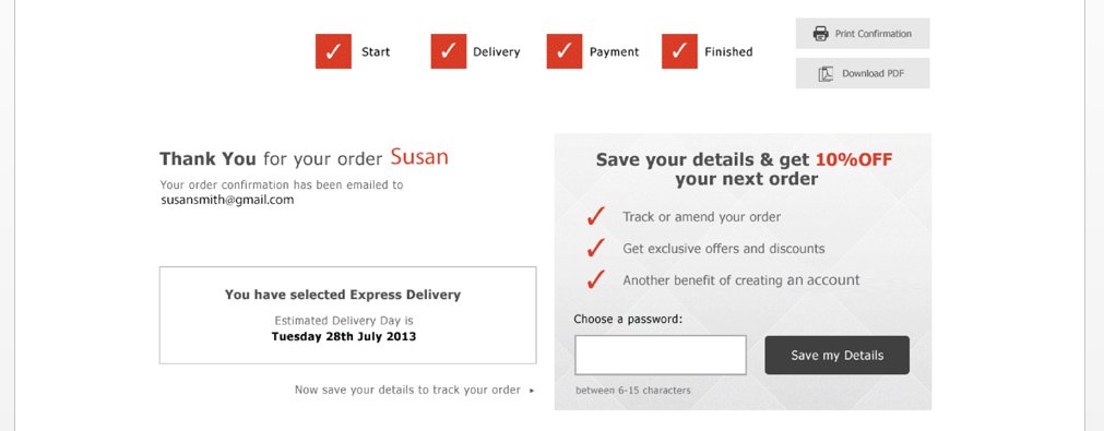
Source: ConversionXL
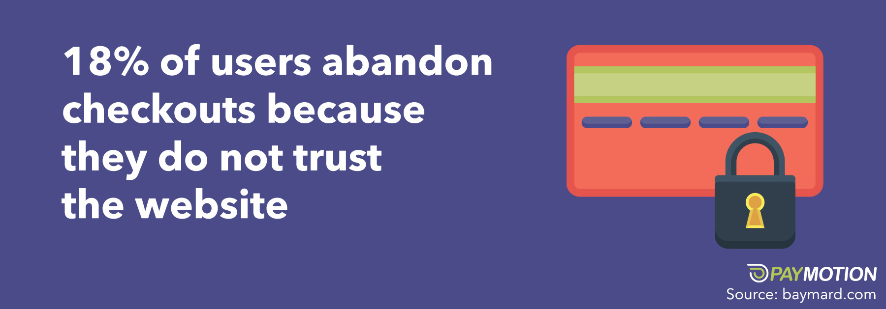
When it comes to purchasing online, there is always going to be a sense of uneasiness when providing credit card details for the first time.
Research from Baymard shows that 18% of users abandon checkouts because they do not trust the website with their credit card information. This lack of trust does not always result from a lack of actual security features, but from the user’s instinctive perception of how “safe” a page is.
There are several best practices that can be used to increase the perceived security of your checkout process.
First, display credibility indicators throughout the process. These can include logos of trusted digital brands, security certification seals, or even unbranded icons that signal safety (e.g. padlock symbols).
Interestingly, Baymard found that logos from well-known consumer-facing brands tended to have the strongest effect on perceived security. For instance, 41% of users said the Norton logo gave them the best sense of trust, while 23% favored the Google logo. Meanwhile, only 6% preferred the SSL-secured logo, despite the fact that SSL affects the actual technical security of the website. This reinforces the difference between perceived and actual security in the eyes of most online customers.
Second, pay attention to the visual layout of the credit card form. Customers consistently felt this section was more secure when it was visually encapsulated – that is, placed in a box with a clear border and different background color:
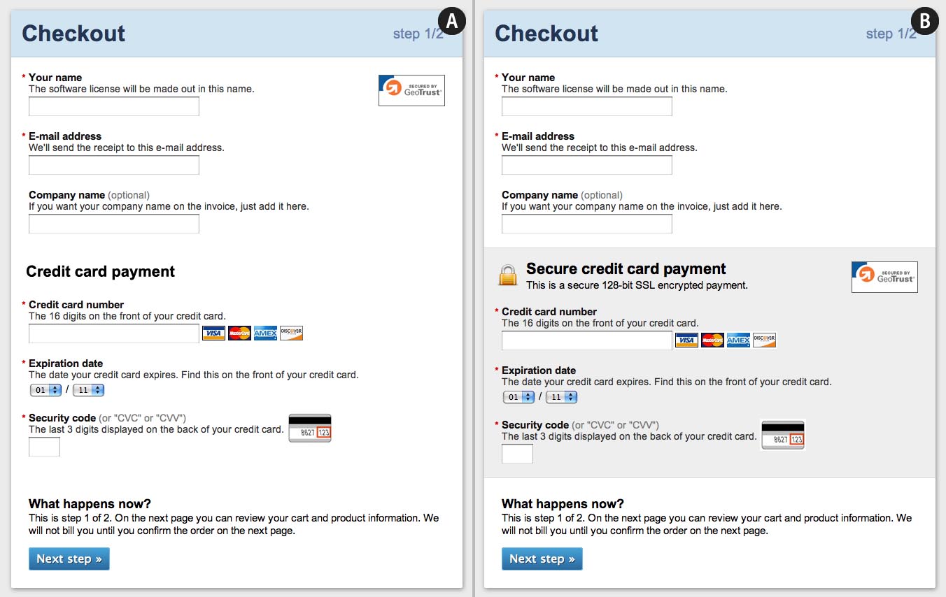
Source: Baymard
In addition, watch out for inconsistent layouts or visual bugs. These can completely kill credibility, as it makes users suspicious that the site has been compromised, or that they are being “phished”. These quirks are surprisingly common, and even occur on many major ecommerce sites. Below is an example from Footlocker’s site:
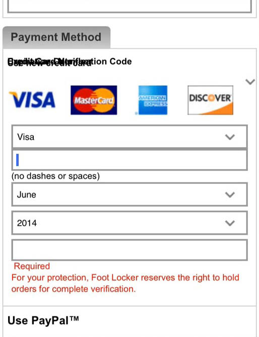
Source: Baymard
If you want to maximize your conversion rates, make sure to test your site on multiple browsers and devices, to ensure these visual quirks are not compromising customer trust.
Ecommerce is a global phenomenon.
With worldwide sales worth an estimated $2 trillion, even the smallest online retailers need to consider their international customers when designing the checkout process. Effective localization of the checkout experience is key if you want to avoid losing international revenue.
There are two ways to localize checkouts.
The first method is to localize payment and currency options. Ideally, your ecommerce platform should be able to detect the IP address of each visitor, so that it can present prices in the local currency. Just as importantly, you should offer all of the preferred local payment methods, and set the most popular local method as the default option. This will help to minimize customer confusion and facilitate a smooth checkout.
The second method is to offer localized inline validation. At the very least, your forms should not display errors when the customer fills in an international phone number or address. Online customers are easily frustrated, and such problems might be enough for them to abandon their carts on the spot. In addition, it would be even better if your address fields could offer localized auto-completion, as this can help to speed up checkout and minimize errors.
By localizing every element of your checkout process, you’ll be able to significantly reduce cart abandonment in international markets.
Your checkout is the final step in the customer journey, and the one with the largest impact on successful conversions. Even small tweaks can make a big difference to the bottom line, so any enhancement is worth the effort.
By implementing the four practices in this blog post, you will be able to greatly improve your checkout design and boost your online sales.
[pardot-form width="100%" height="280" id="11610" title="Blog Form: Grow Your Business Globally"]


