Product pages are the moment of truth for ecommerce sites and if built correctly can have a chance to convert more customers. On average, at least 75% of users that hit your product page will leave without clicking “add to cart”.
In this context, it’s easy to see why product pages are so important, but how can you create effective and aesthetically pleasing product pages that drive conversions? These 6 tips will help to provide an answer.
Spend some time crafting creative and engaging copy for your product descriptions. The product descriptions should be informative and enticing, both telling shoppers about the product and making them want it. Check out Tessmae’s description for one of their condiments. It’s creative and fun, yet informative.
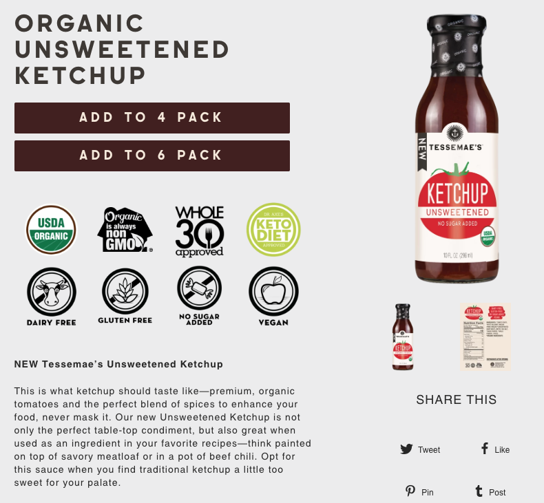
Source: Tessamae's
Think about the voice you’re using when writing the product description. In short, you should be speaking to your audience. If your customers are mainly young women, then talking to them like one of the ‘bros’ most likely won’t produce positive results.
Perceived value is heavily influenced by photos. Simply making product images larger can also potentially convert more customers.
However, professional-looking product images require a great deal of thought and planning. For instance, the surrounding, environment, and details used in each image will influence its overall quality and appeal. With 67% of customers saying that images are “very important” when purchasing products, you’ll really want to get product photos right.
Have a look at Oak Street Bootmakers product photographs. Not only are they clean and professional looking, but they offer several pictures to show the quality and how the shoes can be worn with formal or casual outfits, which help increase the perceived value.
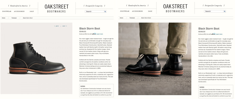
Source: Oak Street Bootmakers
Calls-to-action have one goal: getting visitors to complete a desired action. For product pages, this action is adding your product to a cart.
Some of the design considerations that go into CTAs include the size, color, whitespace, and positioning. For example, different colors stimulate different psychological reactions so put some thought into choosing the correct color. Whitespace can be used to help emphasize a CTA be making it stand prominently in an otherwise bare part of the page. Bartaile’s product page uses whitespace to emphasize both the product and the CTA, and even center the button and photograph to make sure it’s directly in the eye path.
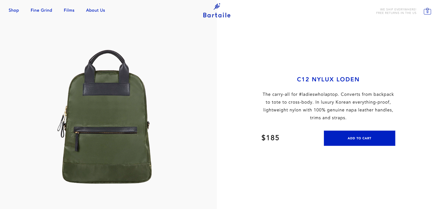
Source: Bartaile’s
In terms of messaging, CTAs should include an action word. “Add to Cart”, “Start a Free Trial”, “Sign Up Now”, are a couple of commonly used CTAs.
Customer reviews are a remarkable tool for their ability to drive sales on the product page, but be strategic in the reviews that you choose promote. Not only can they be used to communicate the merits of a product but they can also be used to build trust or reduce anxiety. What is interesting about user generated customer reviews is that people actually trust them more than critic reviews.
If you are noticing that shoppers are anxious for a particular reason, then look for customer reviews that address that concern. How can you tell what visitors are anxious about? Ask employees in customer-facing roles (they often have gems of information), and study questions and complaints you receive for common themes.
Today, meeting the payment needs of consumers means having multiple payment methods. In fact, YouGov found that 40% of consumes feel more comfortable purchasing from an ecommerce site with multiple payment options. VWO published an even more surprising statistic, which showed a 660% increase in conversion rates as a result of promoting the available payment methods and certificates directly on the product page. You can reap these benefits by adding payment information and badges on to your product pages.
A study by VWO found that the number one reason for cart abandonment is unexpected shipping charges (28%), beating out mandatory account creation (23%) and payment security concerns (13%). Notice it says unexpected shipping charges, not the presence of shipping charges all together.
You can avoid any unwanted surprises by giving customers everything they need to know upfront. Do you offer free shipping? Free shipping on a minimum purchase? Flat-rate shipping? Tell customers how much it will cost them. You may even want to calculate a subtotal that includes the cost of shipping, so to save visitors from a bit of arithmetic.
Not everyone that lands on your product page is going to add your product to their cart. But with these 6 tips you can create awesome product pages that show your product in its best light and increase conversions.


